Safety Signage Poster: The Silent Scream That Saves Lives
Let’s talk about something wildly unsexy but low-key heroic: the safety signage poster. Yeah, I know. That laminated thing stuck near the fire extinguisher that’s been slightly peeling since 2017. The one people walk past like it’s part of the wallpaper—unless something explodes. Then suddenly it’s the Mona Lisa of survival instructions.
But here’s the kicker—when done right, that little sign on a wall might be the loudest voice in the room. It doesn’t blink. Doesn’t take breaks. And it never, ever forgets to remind you that wet floors and live wires don’t mix.
So buckle up. We're about to give safety posters the kind of love song they never knew they needed.
Why Safety Signage Posters Still Matter (Even in the Age of Apps and AI)
Because real danger doesn’t wait for a push notification.
Sure, we live in the world of augmented reality and interactive dashboards. But you know what your brain does not want when a machine is leaking hydraulic fluid or someone just passed out near a breaker panel?
To scroll through an app trying to find the right SOP PDF.
Nope. That’s when the humble safety signage poster shines. Right there. In your face. Doing its job quietly until suddenly it’s the most important thing in the building.
It’s not high-tech. It’s human-tech. Designed for when your pulse is racing, your hands are shaking, and your brain has temporarily turned into mashed potatoes.
Okay, But What Is a Safety Signage Poster, Technically?
Not just “poster with warnings.” It's a visual survival tool.
A safety signage poster is a visual scream in 2D. It delivers important info—fast. We're talking hazard warnings, emergency procedures, PPE requirements, lockout/tagout reminders, exit routes, you name it.
It’s the office equivalent of a street sign that says, “Do not enter unless you enjoy lawsuits.”
These posters don't try to explain why safety matters (you already know why—bones break). They just point and shout: “Look here. Do this. Avoid death.” Simple, right?
Well, it should be.
The Wildly Underrated Psychology Behind Safety Posters
Why do they work when everything else fails
Here’s a brain nugget: when we’re stressed, we don’t read like normal people. We scan. We grab onto colors, symbols, and bold fonts like we’re drowning, and those words are the only lifeline in the room.
That’s exactly what a safety signage poster is designed to do. Big colors. Big icons. Bigger warnings.
You’re not reading for fun. You’re reading to stay alive. So it's better to say something like “EYEWASH STATION →” instead of a 12-point essay about the benefits of ocular hydration.
Also, repetition helps. The more you see a poster, the more it sinks into your muscle memory. You won’t even notice it until one day, you instinctively dodge an exposed wire like a reflex. Thank your signage later.
Where Should Safety Signage Posters Go? (Hint: Not Just the Breakroom)
If it’s out of sight, it’s out of your broken wrist’s range.
Let’s get strategic. You don’t need safety posters everywhere. You need them where it counts.
-
Near known hazards: Chemicals, forklifts, high-voltage equipment, weird steam vents that hiss like angry snakes.
-
At entry/exit points: A “watch your step” at the doorway works better than a lawsuit.
-
Next to emergency tools: Fire extinguishers, first aid kits, eyewash stations.
-
Breakrooms and bathrooms: Weirdly effective. People notice things when they’re sipping tea or taking a mental break from Bob’s relentless whistling.
-
Construction zones: Self-explanatory. It’s a bingo card of hazards.
Bonus: Rotate the posters every few months. Like a seasonal playlist. Because familiarity breeds... invisibility.
Types of Safety Signage Posters (And Why You Need More Than Just One)
You wouldn't wear flip-flops to a welding gig. So don’t slap one generic poster everywhere and call it a safety plan. Here’s what needs to be on your radar:

1. Hazard Warning Posters
These are the OGs. The classics. Think: “Caution: Slippery Surface,” “Danger: High Voltage,” “Warning: Toxic Fumes.”
These posters exist, so you can’t say, “Nobody told me not to lick the battery acid.”
2. Instructional Posters
These walk you through the steps when your brain’s half-melted under pressure. Like how to don a hazmat suit or where to stand when the forklift’s backing up.
Flowcharts. Bullet points. Diagrams. All killer, no filler.
3. Emergency Response Posters
When something’s already gone sideways, these posters go full action-hero. “Fire Exit →”, “CPR Instructions”, “Spill Containment Steps.”
You want these to be idiot-proof. Even if the idiot is you at 3:17 p.m. after skipping lunch.
4. PPE Requirement Posters
What do you need to wear here? Goggles? Gloves? A full face shield and a Kevlar suit? These posters stop you from walking into a zone dressed like it's casual Friday.
5. Cultural or Motivational Posters
Don’t roll your eyes. These can be cool if done right.
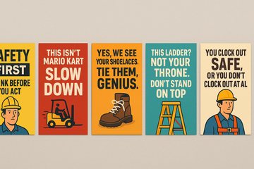
“You clock out safe, or you don’t clock out at all.”
 “Real pros check the harness every time.”
 It’s less about scaring people. More about setting a tone. A vibe. A culture where safety isn’t annoying—it’s just what you do.
What Makes a Good Safety Signage Poster? (And What Makes One Useless)
Let’s play a quick game called Spot the Useless Poster.
If your signage is:
-
Faded beyond readability
-
Covered in tape, mystery goo, or passive-aggressive sticky notes
-
Featuring fonts that belong in a 1998 PowerPoint presentation
-
Hanging somewhere no human eyeball ever looks
…it’s garbage. Sorry, not sorry.
Good Posters Have:
✅ High-contrast colors
✅ Simple, clear fonts
✅ Direct messaging (no riddles)
✅ Clear iconography
✅ Durable material (laminated, weatherproof, sneeze-resistant)
✅ A little edge or humor, if appropriate
Basically, if it looks like someone cared when they made it, people will care when they read it.
Real-Life Screw-Ups That Could’ve Been Avoided (Poster Edition)
Sometimes it takes a story to make it real.
Like the warehouse worker who didn’t know the right fire extinguisher type for an electrical fire. He grabbed the closest one (water-based, of course), and fried the whole panel—plus gave himself a minor zap.
Had there been a safety signage poster that said “Electrical Fires: Use CO2 Only,” this could’ve been a whole lot less... zappy.
Or the forklift crash that happened because someone didn’t know to honk before turning a blind corner. Poster could’ve said: “HONK → Every. Single. Turn.” Cheap. Easy. Effective.
These aren't cautionary tales from a textbook. They're Monday morning reports that start with, “Well... that could’ve gone worse.”
Don’t Be Afraid to Get Weird (Yes, Weird Works)
There’s a reason ads use humor, surprise, and emotion. Because it sticks.
Why can’t safety posters do the same?
“This isn’t Mario Kart. Slow down.”
 “Yes, we see your shoelaces. Tie them, genius.”
 “This ladder? Not your throne. Don’t stand on top.”
 Weird makes people pause. Pausing makes people think. Thinking makes people... not get hurt. Win-win-win.
If your workplace culture allows for it, get a little cheeky. The point is to get noticed, not win an art competition.
Updating Posters: Not a One-and-Done
Here’s the harsh truth: safety signage posters expire. Not like yogurt—but close.
What was relevant last year might not cover new risks this year. New equipment, new layout, new team members—all reasons to revisit what’s on the walls.
Make it part of your safety audit. Take ten minutes every quarter and ask:
-
Does this still apply?
-
Is it still legible?
-
Has anyone looked at this in weeks?
If the answer to any of those is “meh,” time to swap it out.
Poster Design Pro Tips (You Don’t Need to Be a Designer)
1. Use Online Templates, But Customize
There are great templates out there. But add your logo. Use team photos. Tweak the tone so it feels like you, not some generic OSHA robot.
2. Print Like You Mean It
A grainy black-and-white printout on A4 paper? No. Just no.
Go big. Go laminated. Use bright inks that don’t fade faster than your team’s attention span.
3. Involve the Team
Let them help design or vote on poster ideas. It builds ownership and makes people more likely to respect what’s on the wall.
Final Words (a.k.a. The Poster Pep Talk)
The safety signage poster is not just a box you check so the inspector doesn’t yell at you. It’s not wallpaper. It’s not filler. It’s your workplace’s way of saying, "We give a damn."
It might not be flashy. It’s not trending on TikTok. But if it means one less slip, one less burn, one less “uh oh” moment—then that $10 poster just saved you thousands.
And maybe, just maybe, someone’s life.
So take your signage seriously. Make it bold. Make it clear. Make it real.
And whatever you do, don’t ignore the weird little square on the wall. That thing? It’s watching out for you.
Need custom, bold, employee-proof posters that don’t fade into the background?
👉 Explore safety signage posters at AarohiPixelPrint.com — because smart walls save lives.


