Safety Awareness Poster for Employees: Your Loudest Quiet Reminder at Work
Nobody walks into the office on a Monday morning thinking, “Oh boy, can’t wait to stare at the safety awareness poster by the microwave.” That’s just not a thing. And yet—those posters? The ones crinkled from the AC blowing too hard, half-covered by someone’s leftover birthday party invite? They might be the only reason Kevin from shipping still has both eyebrows.
We’re gonna talk about that poster. The underestimated hero of your workplace wall. The weird little rectangle of wisdom trying to scream common sense in a place where common sense often clocks out by lunch.
Why Even Bother With a Safety Awareness Poster?
Because you can’t staple a first aid kit to someone’s forehead.
Let’s get this straight—nobody wants to get hurt at work. But stuff happens. Someone’s rushing. Someone’s distracted. Someone’s trying to carry an entire pallet of printer paper with one hand while sipping burnt coffee with the other. Welcome to the real world.
A safety awareness poster for employees is like a little paper guardian angel with bold fonts and a color-coded layout. It doesn't hover. It doesn’t nag. But it’s there. Quietly yelling, “Hey... maybe don’t walk under that suspended load?”
Because, let’s face it: your brain isn’t always on. Especially not after a 3-hour Zoom call where everyone just repeated the same five phrases in different tones of voice.
Posters Aren’t Just Paper. They’re Mental Speed Bumps.
And sometimes, people need a bump to slow the heck down.
Ever had that moment where you walk into a room and forget why you went there? That’s your brain on autopilot. Now imagine that autopilot in a warehouse, an office, or a lab with open flames, electrical panels, or—yep—trip hazards that breed like rabbits.
A well-placed safety awareness poster snaps you out of it. Not dramatically. Not like “a-ha! I will now change my life!” But in a quiet, practical way. Like a post-it note from the universe reminding you that fire extinguishers aren’t decorative.
And it doesn’t need to be a work of art. It just needs to hit that sweet spot between “scary enough to pay attention” and “not so ugly it gets ignored.”
What Makes a Safety Poster Actually Work?
Not corporate jargon. Not clichés. Something that sticks.
You know what doesn’t work?
“Think safety. Work safely.”
“Be aware. Take care.”
“Your family wants you home safe.”
Yeah, no kidding. Thanks for the insight, Captain Obvious.
Here’s what does work:
-
Specificity. Instead of “Be safe,” try “Don’t leave wet floors unattended unless you enjoy paperwork and sprained ankles.”

-
Visuals that hit. A stick figure falling is fine. A real image of someone narrowly avoiding a hazard? Even better.
-
Language people actually use. “Don’t be a hero—tag out the damn breaker.”
-
A little humor. Laughter disarms. It makes the message stick. Like, “Hard hats: because brain surgery is expensive.”
If your poster sounds like it was written by someone in a polyester tie with zero field experience, trash it and start again.
The Places Posters Matter Most
Location, location, don’t trip here location.
You can't just stick your safety awareness poster for employees behind the copy machine and expect results. (Okay, you can—but you’ll get the same results as sticking a “do not enter” sign inside a locked safe.)
Posters have to live in places where the risk lives.
-
Breakrooms – People let their guard down here. Great spot for reminders about hand hygiene, microwave etiquette (which is absolutely a safety issue—looking at you, explosive spaghetti), and emergency exit maps.
-
Near exits/entrances – Catch them coming in hot or heading out tired.
-
High-risk zones – Chemical stations, maintenance rooms, warehouses. Anywhere that sounds like it could use background music from a Final Destination movie.
-
Restrooms – Weirdly effective. You're alone. You’ve got 30 seconds. Your eyes wander. Boom—poster hits.
Poster Types: Not All Safety Messages Wear the Same Hat
Let’s break it down. One size doesn’t fit all. Not even close.
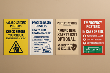
1. Hazard-Specific Posters
These guys are the warning labels of the poster world. Electrical risks, fall hazards, pinch points. If there’s a “you might lose a limb here” moment, this poster needs to spell it out—boldly.
Picture it: a poster near the compactor that says, “Check before you chuck. Someone might be inside.” Disturbing? Yup. Effective? Hell yes.

2. Process-Based Posters
Think step-by-step reminders. Like how to properly shut down a machine, don PPE, or handle spill cleanups. Clarity is king here. No room for fluff or fancy metaphors.
Put the steps. Add the visuals. Keep it idiot-proof. You’re not writing a novel; you’re building a survival guide.

3. Culture Posters (a.k.a. The Vibe-Setters)
These are subtle. More about attitude than action.
“Around here, safety isn’t optional.”
“No shortcuts. No excuses.”
They don’t tell you what to do—they remind you who you are (or at least, who your workplace pretends to be on the official values poster during onboarding).

4. Emergency Posters
Fires. Shocks. Seizures. These aren’t the posters you read for fun. They’re what you read when something’s already gone wrong.
Big fonts. Bold icons. Maps. Instructions that don’t assume someone has functioning Wi-Fi or critical thinking skills in the middle of a panic attack.

The Human Side of Safety: Real Stories > Made-Up Warnings
You want your safety awareness poster to matter? Tell a damn story.
Like the guy who microwaved his metal lunchbox. Or the time someone “just popped in real quick” to fix something live and left with a new appreciation for rubber gloves and second-degree burns.
Real incidents. Real people. When posters reference real workplace experiences—anonymized, obviously—they go from “meh” to memorable.
And don’t forget the heroes. The person who noticed the gas leak. The one who called out a wobbly scaffold. Honor that stuff. Celebrate the behavior you want. It doesn’t have to be a parade. Just a poster that says, “Thanks, Tanya. You saved us from a very spicy Thursday.”
Design Tips for Posters That Don’t Suck
Look, nobody wants a poster that looks like it was made in MS Paint by someone with commitment issues. Let’s up the game.
Color Psychology Is a Thing
-
Red = Danger (duh)
-
Yellow = Caution
-
Blue = Info
-
Green = Safe/First aid
Use color to guide the eye. But don’t overdo it—unless your goal is “retina damage.”
Fonts Matter (A Lot)
No cursive. No Comic Sans. Keep it readable from six feet away while someone’s balancing coffee and existential dread.
Images > Walls of Text
Humans are lazy readers. Use diagrams. Use real photos (of your team, not weird stock models with perfect smiles). Use arrows. Use icons.
Size and Placement
Big enough to see. Bold enough to grab. Placed where eyes naturally go. Test it by asking someone to find the poster while half-distracted by their phone.
If they can't spot it in under 5 seconds, you’ve failed the vibe check.
Updating Posters: The Rotation Rule
Same poster for 3 years? Congrats. It’s invisible now.
People tune out what they’ve seen too often. Rotate your safety posters every few months. Use seasonal themes if you’re feeling extra. “Winter slips are real, folks” hits different in January.
Or do a “poster of the month” spotlight. Maybe even let employees vote for the most relatable one. Winner gets bragging rights or a donut. Both work.
Digital + Physical = Maximum Safety Mojo
QR codes aren’t just for restaurants anymore.
Link your posters to short videos, emergency plans, or incident report forms. One scan = more context. Especially helpful for new hires who need a visual tour of “what not to touch unless you enjoy pain and paperwork.”
Posters shouldn’t replace training—but they should reinforce it. Like a sidekick who never shuts up, in a good way.
Final Thought: Posters Don’t Fix Culture. People Do.
Let’s keep it real.
If your management doesn’t back up what the posters preach, it all goes to hell. Fast. The sign can say “safety first,” but if your team gets chewed out for reporting near-misses? Posters turn into wallpaper.
So start with culture. Then reinforce it with posters that don’t talk down to people.
Because the truth is... nobody likes safety posters.
But they like what they protect—their bodies, their coworkers, their paychecks.
So if one poster, one sentence, one glance saves a back, a hand, a life?
Totally worth it.


