Workplace Hazard Safety Poster: The Underdog Hero of the Breakroom Wall
You know that poster on the wall—the one next to the busted water cooler and the vending machine that sometimes gives you two chips instead of one? Yeah, that one. The workplace hazard safety poster.
You probably haven’t given it much attention unless you were waiting for your coffee to drip painfully slow or needed something to avoid eye contact with your supervisor during a one-sided rant about productivity. But here’s the wild part: that dusty, dog-eared poster could be the thing standing between you and a trip to the ER.
And no, this isn't one of those “inspiring journey of safety” puff pieces. This is the real, sweaty, frustrating, slightly sarcastic truth about why those hazard safety posters matter—and why they often suck, but don’t have to.
The Poster No One Reads… Until They Have To
Let’s be brutally honest. Most of us treat safety posters the same way we treat software terms and conditions: we scroll (or glance) and agree (or ignore). We don’t read them. We don’t care. Until something goes wrong.
It’s only when Brad from receiving nearly loses a finger because of a rogue box cutter that everyone suddenly notices the poster that’s been screaming “CUT HAZARD – USE GLOVES” in size 72 font right next to the workstation.
That’s the thing about a workplace hazard safety poster—it’s not just decoration. It’s a panic-prevention device disguised as boring wall art.
Why Safety Posters Have a Branding Problem
They’re Trying Too Hard (Or Not Hard Enough)
Let’s talk about the visual crimes committed by safety posters across the globe. You’ve seen them. Cartoon stickmen falling into pits. Overused warning triangles. Slogans like:
-
“Safety starts with YOU!”
-
“Don’t be a fool—use your tool (properly).”
-
“Your family wants you home.”
Okay, that last one’s trying to guilt-trip us. The first two? Either too vague or too corny. And that’s the heart of the problem: most workplace hazard safety posters don’t sound like real humans wrote them. They sound like HR bots trying to win a design contest from 2004.
And if it doesn’t feel real, it doesn’t register.
The result? Eye glaze. Nobody looks. Nobody remembers. And when the floor gets slippery or the wires are tangled like headphone cords from 2011, nobody’s ready.
The Psychology Behind Why Posters Work (When Done Right)
You’re Not Teaching—You’re Nudging
Here’s something we forget: safety isn’t always about training people. Sometimes, it’s about reminding them.
Humans are weird. We know the floor is wet. But unless something reminds us in the exact moment our brain’s running on caffeine fumes and frustration, we still might slip.
A good workplace hazard safety poster doesn’t dump rules. It whispers, “Hey, maybe don’t trip over that cable again like last week?”
It’s like a sticky note from the universe saying, “Pay attention, you beautiful, clumsy meatbag.”
What Makes a Safety Poster Actually... Work?
You want a poster that doesn’t just exist. You want one that sticks in your brain like a jingle from a bad shampoo ad.
1. Be Specific, Not Inspirational
Don’t just say “Be careful.” Say, “Keep hands clear of conveyor belts after 3 PM maintenance.” Give context. Give something that feels grounded in the real, environment of your workplace.

2. Use Humor, But Don’t Be a Clown
A little humor can wake people up. “Don’t lose your grip—your fingers need therapy too” is better than “Injury hazard: grasp safely.” But don’t go full meme. It’s a safety poster, not your cousin’s Instagram story.

3. Keep It Visual
Big icons. Bold text. Maybe a weirdly drawn eyeball if it’s about chemical splash risk. Whatever you do, don’t write a novel. You’ve got three seconds of attention—use them well.
4. Talk Like a Human
Use the same voice you’d use if you were warning your co-worker not to do something stupid. Friendly. Direct. A little chaotic, maybe, but real.
Common Workplace Hazards That Deserve a Poster
You’d be shocked how many hazards go unnoticed because “that’s how we’ve always done it.” Time to list the repeat offenders—the hazards that deserve their own dedicated posters ASAP.
1. Slips, Trips, and Falls
The most boring-sounding hazard and the most common one to mess people up. A little water. A poorly placed mat. That one step nobody remembers exists. All it takes is one distracted stroll and boom—bruised tailbone and an awkward trip to HR.
Poster idea:
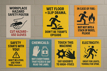
"Wet Floor = Slip Drama. Don't Be Today’s Episode."

2. Chemical Exposure
Gloves, goggles, and a “Don’t mix bleach and ammonia, genius” warning should be somewhere very, very visible. Because guess what? People still mess this up.
Poster idea:
“Chemicals: Not Everything That Fizzes is Safe. Read the Label.”

3. Machinery Hazards
Moving parts. Sharp edges. Belts that spin fast enough to ruin your weekend. These need visual posters. Like, “here’s what the aftermath looks like” level visual.
Poster idea:
“Touch This Machine Mid-Spin? Say Goodbye to High-Fives.”

4. Fire Safety & Exits
Fire drills are cool and all—until the exit is blocked by 12 boxes of printer paper. People need to know where to go. Posters near exits, near extinguishers, and near any flammable madness are a must.
Poster idea:
“In Case of Fire: RUN. But Not Into a Stack of Boxes, Please.”

5. Electrical Hazards
That overloaded plug with 4 extension cords and a coffee machine? Yeah, it needs a visual reminder that electricity isn’t your buddy when it arcs into your hand.
Poster idea:
“Electricity: Great for Lights. Terrible for Your Spine.”

Where You Put It Matters More Than You Think
Posters Don’t Work in Hiding
You can have the best-designed poster in the universe, but if it’s hiding behind the fridge or stuck behind a whiteboard no one uses anymore, it’s pointless.
Best spots for workplace hazard safety posters:
-
Near the actual hazard. Not “general area.” Next to the danger zone.
-
By the entrance. Hit them before they’re too distracted.
-
At eye level in high-traffic areas. Not the ceiling. Not floor-level. Aim where the eyes go naturally.
-
In bathrooms. Sounds weird, but hey—captive audience.
Also, rotate posters every few weeks. Familiarity kills effectiveness. Shake things up. Add a new color. A new joke. Something to jolt that sleepy attention span.
DIY vs. Pre-Printed: Does It Matter?
Some companies buy mass-produced posters. Others slap together something in Microsoft Word, print it out crooked, and tape it up with a prayer.
Here’s the truth: it doesn’t matter how fancy your poster is. If it works, it works.
But. And this is important—if it looks like nobody cared about making it, no one will care about looking at it. Even if it’s DIY, make it pop. Use color. Use bold shapes. Maybe even laminate it (go wild).
Real-Life Poster Wins (Yes, This Happened)
Let’s switch gears. Storytime.
A small packaging warehouse in Delhi had an issue—forklift drivers kept forgetting to honk when reversing. It became a running joke. Until one day, a junior staff member nearly got clipped.
Instead of another “mandatory horn use” memo, someone printed a ridiculous poster: a picture of a cat in a hard hat with the words, “HONK, OR THE CAT GETS IT.”
People laughed. They honked. Incidents dropped.
Sometimes, humor reaches where rules can’t.
When Safety Culture Starts With Ink and Tape
Let’s be real—posters alone aren’t magic. They won’t change a toxic work culture or fix a lazy attitude toward safety. But they’re a start.
They’re a visible sign that someone gives a damn. They set the tone. They say: “We care. We’re paying attention. You should, too.”
And that matters.
Because if a single workplace hazard safety poster can make one person pause, rethink, or take two extra seconds to glove up before handling glass, then it’s already done its job.
Final Words (And One Tiny Callout)
If you're in charge of safety in your workplace—whether you're a manager, an HR rep, or just the person who always notices things before they break—take 15 minutes this week.
Walk around. Look at your posters.
Ask yourself:
-
Is this clear?
-
Is it in the right spot?
-
Should I pay attention to it?
If the answer is “meh,” maybe it’s time to upgrade—not with fluff, not with slogans that feel like they belong on an outdated coffee mug.
But with something real. Something bold. Something that makes someone feel, even if it’s just a chuckle or a pause, before they step into a hazard zone.
Because in the end, that pause might be the most important second of their shift.
Want hazard posters that don’t suck? Visit aarohipixelprint.com and check out designs that speak to humans. Safety doesn’t have to be boring. It just has to work.


